


Vary - Visual identity & packaging design
In my bachelor's thesis, I create a new visual identity for period product packaging, aiming to normalize menstruation in the modern social landscape. Through detailing the history of the period tabu, I shine light on modern problems pertaining to education and advertising, as well as packaging and branding.
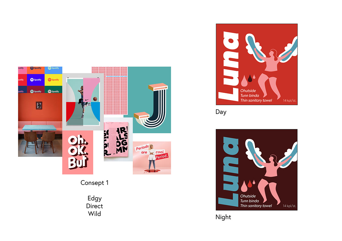
To build a sound basis for my research, a user study was conducted, from which I define key points where menstrual product packages today are failing. Based on these key points, I create a meaningful, relatable and conversation-starting period pad brand with accompanying packaging.

We must get rid of the period tabu and normalise the subject.
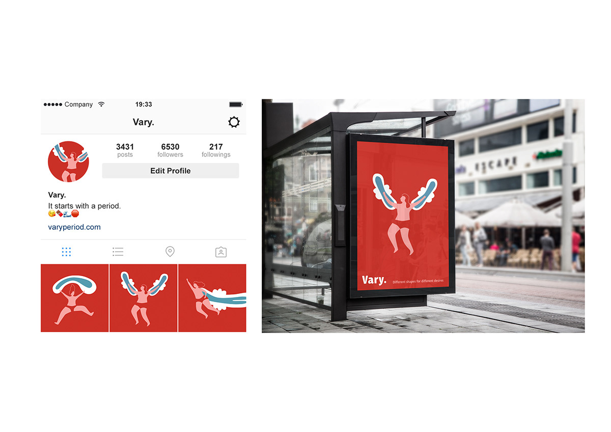
Through the visual look of the packagings we could be able to improve the conversation and make the brands differ from each other.
The users should be able to get support and acceptance from the visual look as from the brand.
Target:
People in the age of 10-30, but focusing on teens who have just gotten their periods.
This group gets the most pressure from the period tabu.
This group gets the most pressure from the period tabu.
Insight:
Periods have been showcased either as the epitome of womanhood or as something super cool that you have to be proud of, if we don't take the clinical cleaning product look into consideration. To break the tabu we must first be able to make people accept their bodies and their functions as normal, stop avoiding the subject or only brining up the negative side of periods. When we have removed the obstacles around open talk about periods, then will the tabu be able to start to break. People don't start talking about a tabu subject just because they are told it's ok, but because there is a reason for it.
Message:
Don't be ashamed of your periods.
Strategy:
Through normality bring pleasure in to talking about periods.


Abstract:
The subject of my thesis work is to create a new visual look for period product packaging, which would help in normalisation of the matter. Going through the history of the period tabu I explain the reasons why periods are a stigma in our social life, education and advertising as well as packaging and branding.
In my research of the subject I also conducted a user study, from where I was able drive the main issues of the visual style of the packaging. Aiming to create a meaningful and relatable visual look that stands out, I used my research and the insights of the users to create my design.
I go through the steps of creating a visual look in my design process, such as benchmarking and conceptualisation. Finally I present the parts of the visual look and the guidelines on how to use them for different purposes. The result enables positive conversation about periods and gives users something to relate to.
Click here to see the whole thesis work.


